Friday, February 21, 2025
Thursday, February 20, 2025
Zumba Masterclass at Jazz It Up Studios
This past Monday’s masterclass with my friends Alex and Marlon was absolutely fantastic! With our blend of form and styles, we each gave a thorough presentation in showing out. Many thanks to our friends, supporters, and community for inspiring us to learn, improve, and just be who we are! In between songs, I took out my Panasonic S5 camera to take some shots. Since the beginning of the year, I've started to shoot solely in black and white. After years of shooting commercially, I am in the process of developing a different personal style. To help that process along, I am only using vintage manual focus Minolta lenses. That's right. I had to nail the timing and focus for each shot. It's a challenge, but it's one that I am excited to master.
Saturday, February 15, 2025
It's going to be a Zumba Weekend
I hope that everyone has enjoyed a great week of work, family, and of course, exercise. I'm heading out this morning to teach Cardio Dance at the YMCA San Pedro and then on Monday morning, I'll be joined buy two fellow instructors to host a 2-hour masterclass. Got something planned? I hope that it involves quick movements set to over 118bpms!
Wednesday, February 12, 2025
IONO Logo
An Exploratory logo that I designed in the early 2000s' after being heavily influenced by the style coming out of Berlin and Tokyo at that time. I was seeing the marks showcased in LogoLounge, which at that time had a techno-Eurasian rave and club kind of vibe. There is definitely room for improvement but I still like the feel that it gives off.
Tuesday, February 11, 2025
From the archive: Puma Run
Hmm, I picked my personal brand colors way back. Looking at my past work, I see clearly my preferences for yellows and oranges as they made their way into my portfolio work.
Monday, February 10, 2025
Color Inspiration: Turquoise
Pops of turquoise, teal, and gold throughout my client projects. If I'm using blue, then this is the shade that I prefer. It feels vibrant and uplifting with enough contrast against white and almost any other color.
La Capilla
I went here because I like the font. The choice of a font denotes a choice of decorum. They had to have hired a very skilled graphic designer to taste the food, hear the restaurants backstory, peer through its history and location and then decide, “yep, it’s gotta be this font. And it has to be in Pantone something something”. That’s how we designers do.
Monday, February 3, 2025
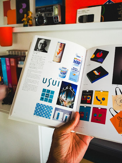
Takahisa Kamijyo
Examples of word marks and logos from Japanese designer Takahisa Kamijyo. He graduated from Tokyo National University of Fine Arts in 1964 and established his own studio, Kamijyo Studio Co., ten years after. I think that he still runs his studio today. Featured in 2003's Tokyo Art Directors Club "Who's Who" Annual.
Friday, January 31, 2025
A Kodak Moment
The simplest design is oftentimes the best. Although they stumbled as a business, Kodak definitely succeeded as a brand. The easily recognizable colors and logo conjure up warm feelings of nostalgia across the world. Think of Canon and Nikon and you might think "professional". Now think of Kodak. I imagine "fun, film, photo labs, joy, sharing, anticipation, excitement".
Despite essentially withdrawing from the camera market, there are enough advocates for Kodak to continually shape its perception as a brand. And that right there is the power of branding.
Despite essentially withdrawing from the camera market, there are enough advocates for Kodak to continually shape its perception as a brand. And that right there is the power of branding.
Wednesday, January 29, 2025
Pizzicato 5: Happy End of the World
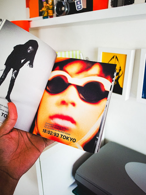
I was introduced to Pizzicato Five in 1997 through their tenth studio album, "Happy End of the World". Up until then, no Japanese music group had really infiltrated the U.S. market. There were attempts by artist such as Dreams Come True, Utada Hikaru, Toshinobu Kubota and even B'z, but Pizzicato Five's retro pop appeal sat nicely alongside Beck, Björk, Mike Flower Pops and others.
I found their music very catchy and appealing but as a designer, their album graphics and photography were amazing. They heavily influenced my early work, which you can see in my post from Sept. 21. Do I still have their CD? Do I still listen to them? That's a definite yes!
I found their music very catchy and appealing but as a designer, their album graphics and photography were amazing. They heavily influenced my early work, which you can see in my post from Sept. 21. Do I still have their CD? Do I still listen to them? That's a definite yes!
Monday, January 27, 2025
Katsu Kimura
Examples of branding and packaging from Japanese designer Katsu Kimura. In 1960 he established Katsu Kimura & Packaging Direction Co. In the present day, I still see the influence of his work in the packaging artwork at department stores and markets across Tokyo. Featured in 2003's Tokyo Art Directors Club "Who's Who" Annual.
Subscribe to:
Comments (Atom)


