Despite essentially withdrawing from the camera market, there are enough advocates for Kodak to continually shape its perception as a brand. And that right there is the power of branding.
Friday, January 31, 2025
A Kodak Moment
The simplest design is oftentimes the best. Although they stumbled as a business, Kodak definitely succeeded as a brand. The easily recognizable colors and logo conjure up warm feelings of nostalgia across the world. Think of Canon and Nikon and you might think "professional". Now think of Kodak. I imagine "fun, film, photo labs, joy, sharing, anticipation, excitement".
Despite essentially withdrawing from the camera market, there are enough advocates for Kodak to continually shape its perception as a brand. And that right there is the power of branding.
Despite essentially withdrawing from the camera market, there are enough advocates for Kodak to continually shape its perception as a brand. And that right there is the power of branding.
Wednesday, January 29, 2025
Pizzicato 5: Happy End of the World
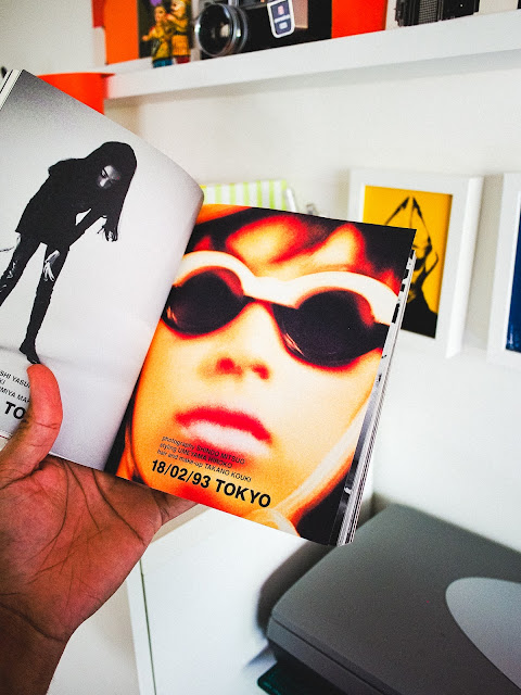
I was introduced to Pizzicato Five in 1997 through their tenth studio album, "Happy End of the World". Up until then, no Japanese music group had really infiltrated the U.S. market. There were attempts by artist such as Dreams Come True, Utada Hikaru, Toshinobu Kubota and even B'z, but Pizzicato Five's retro pop appeal sat nicely alongside Beck, Björk, Mike Flower Pops and others.
I found their music very catchy and appealing but as a designer, their album graphics and photography were amazing. They heavily influenced my early work, which you can see in my post from Sept. 21. Do I still have their CD? Do I still listen to them? That's a definite yes!
I found their music very catchy and appealing but as a designer, their album graphics and photography were amazing. They heavily influenced my early work, which you can see in my post from Sept. 21. Do I still have their CD? Do I still listen to them? That's a definite yes!
Monday, January 27, 2025
Katsu Kimura
Examples of branding and packaging from Japanese designer Katsu Kimura. In 1960 he established Katsu Kimura & Packaging Direction Co. In the present day, I still see the influence of his work in the packaging artwork at department stores and markets across Tokyo. Featured in 2003's Tokyo Art Directors Club "Who's Who" Annual.
Inspiration
From the Jazz album "Fats" in London - 1938-1939. Most cover designs were using standard fonts that looked like League Gothic and Aurora but the artist instead chose something playlist and unconventional.
From the archive: Got2b SoSmooth
Developed in 2002, this was my first opportunity to design a line from the ground up. Before this, my title was production artist. Designs were sourced through outside agencies but being in-house, I felt that if given a chance I could design better packaging options. My very supportive marketing director and art director gave me an opportunity and that began my twenty-year career in this industry. Immediately I was promoted to a graphic designer! I have no problem asking for a chance. It can lead to great things.
Friday, January 24, 2025
Have a good weekend
No more fonts, Pantone colors, and creative strategizing. It’s Friday. Time to change the channel to a good TV show. Right now I’m loving “In the Kitchen with Abner and Amanda” on the Magnolia Network. I’m inspired to cook something. After I rest up of course. Enjoy your weekend peoples!
Tuesday, January 21, 2025
How I got into Graphic Design
My interest in design was sparked by my family’s nostalgic Kodak and Polaroid family albums, Stevie Wonder record album covers, and the color Orange. Specifically that distinct shade of burnt orange that was widely applied in the 70s to velvet couches, kitchenware, clothes, wallpaper, and rotary phones. As a child, I would love to spend hours sitting on the floor, meticulously scanning the pages of our family album. It was filled top to bottom, right side up, and even sideways with beautiful and most times blurry instant prints that captured nothing but happiness. And since these pics were from the decade of the 70’s, I got to see my mom’s look transform from something like the Supremes to London Mod-Squad, and from Black Power to shiny disco.
Our kitchen counters were stacked with orange, brown, and avocado-colored Pyrex bowls and Tupperware containers screen printed with the most unique geometric patterns. Sometimes they were decorated with yellow florals, and other times red roosters. I’d watch my mom season and flour chicken in those. In each room of our house were vinyl records spread across the carpet wall to wall. They kind of record covers that folded out into three or four panels, filled with incredible images that blended bold typography and design with unique compositional layouts. Despite not knowing what graphic design was, I had an understanding that someone made that. Someone unique, possessing a skill I didn't have.
When I was five years old, my oldest brother Daryl, who was 13 years older, gave me a stack of Marvel and DC comics to start to journey into the unknown, as Stan Lee would put it. I had my library comprised of volume issues of X-Men, the Micronauts, Incredible Hulk, the Avengers, Rom the Space Knight, Conan The Barbarian, Ghost Rider, Warlord, Amethyst, and Heavy Metal. And while I vividly remember all of the intricate and interwoven storylines, I also remember printing inconsistencies and dot patterns.
A lot of times the color would bleed over the character lines. Or that the paper stock would yellowed, altering the look of the Hulk, for example, from one page to the next. With closer inspection, I noticed that there overlapping colored dots, easy to spot on the paper used on the inside pages of the comic books, but not so much on the glossier cover paper. Then I examined the printing of Steve Wonder’s “Music Of My Mind”, and Parliament’s “Mothership Connection”, printed on what looked to me like cardboard-colored paper, and I knew I stumbled upon something, but not enough to know the term “graphic design”. But I did know that somebody with a wild imagination had made all of that. That observation, curiosity, and need to make something is what led me to become a designer myself.
Sunday, January 19, 2025
The coolest dad hat ever!
If you know what's up, then you're cool too. I used to create screen-printed logos of Freestyle Fellowship and the Hieroglyphics onto tshirts for myself and my friends in high-school. Over twenty-three years later and I'm still representing 93 till infinity.
1960 Journal of Commercial Art
Front and back cover by Ivan Chermayeff. I found this at the Long Beach Antique Faire in really good condition.
Saturday, January 18, 2025
Georgia Max Coffee
There are a hundred things that I miss about living in Japan. Morning walks to grab a vending machine hot canned coffee is one of them. I think I can find something similar at Mitsuwa in Torrance but we all know that it’s not the same experience.
Something About April
Found a vinyl album cover that I shot for Adrian Younge’s “Something About April” at a record store. I want to run down the street holding it high over my head and yell “I shot this! I shot this!”
The Graphic Design of Yusaku Kakekura
Out of print but thanks to my local library I get to check out his spectacular work as often as I like. The Expo'70 graphics are my favorite. Can you imagine what Tokyo must have been like leading up to the world's expo?
Shoutout L.A.
As I have aged I am being presented with the challenge of making my work known to younger brands. The last four years have been challenging but I’ve been fortunate to have a network of friends and family who have supported me in the last twenty. Being more vocal and opening up has sparked more of an interest in what I do as well as presenting opportunities for growth.
If you have the time, check out this interview with Shoutout LA.
https://shoutoutla.com/meet-kyle-desean-johnson-graphic-designer/
If you have the time, check out this interview with Shoutout LA.
https://shoutoutla.com/meet-kyle-desean-johnson-graphic-designer/
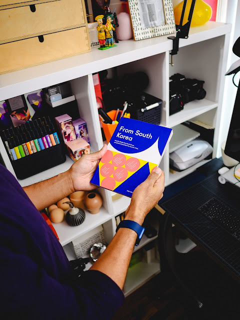
From South Korea
Another addition to the library. Admittedly I know very little about the graphic design landscape there but this book is going to help fix that. There’s a wonderful, nostalgic mid-1990s flair to a lot of the work that will have me studying the pages in detail. Compiled and published by Counter-Print books. It's bold and colorful. Get this.
Studio Vibes
This is my desk—my studio, really. I once thought about renting a dedicated office space, but dropping a thousand a month on rent and utilities just didn’t appeal to me. Besides, I’d probably have the same square footage if I worked at a design firm. Space isn’t an issue; it’s the vibe that matters. My corner has its own mood, much different from my wife’s neat desk right next to mine. Here, I’m surrounded by books, magazines, vintage lenses, manuals, boxes, paper samples, action figures, lighting gear, an extra pair of socks, and even an air fryer just out of frame. It's convenience within arm's length.
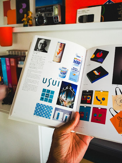
1994 Japanese Package Design Association Member's Work
Japan is the land of great packaging. This is by far the greatest reference and inspirational book that I own. Don't let the age of this compilation lead you to believe that it's outdated. I guarantee that if you step into any 7-Eleven, Lawson's or Sunkas convenient store, you will see the legacy of this work. Old is gold!
Polaroid Land Camera Brochure
Polaroid Land Camera brochure. I like the layout and the typography of the past much more than current camera brochures. I have a working 420 model with peel-apart film that I'm saving for something monumental.
Music of My Mind
As far back as I can remember, this album cover sparked my curiosity about photography and graphic design. Stevie Wonder's Music of My Mind is packed with stunning images, bold typography, and layouts that caught my eye as a kid. I didn’t know what graphic design was back then, but I understood that someone created it—someone with a skill I didn’t have, but knew I wanted to learn.
Archigram 1961-1974
Archigram 1961-1974 (Architecture and Performance) poster by designer Ralph Schraivogel—an absolute standout featured in New Typographics 2 back in 1997. As a design student, I was captivated by the innovative techniques that he used to create this work. Almost thirty years later it's still fresh!
Fruits of Nature
If there’s one music group that encapsulates my vibe, it’s The UMC’s, a rap duo from Staten Island that played a huge role in shaping my confidence and expressive personality. Back in high school during the early '90s, I pretended to vibe with the same MCs all the other Black students were into. But in reality, I gravitated toward artists like The UMC’s and Leaders of the New School. Their infectious rhymes and uplifting energy resonated with me at a time when it wasn’t ‘cool’ to smile and be happy.
Decades later, I still carry that with me—working to bring uplifting vibes to everything I do.
Decades later, I still carry that with me—working to bring uplifting vibes to everything I do.
Subscribe to:
Comments (Atom)


